Postcode Discovery Redesign
Redesigned Sky Broadband discovery to surface postcode-specific deals upfront, simplifying the journey and aligning with competitor best practice for faster, clearer decision making.
Redesign
Role
UI Designer
Timeline
8 weeks
team
2 Enginners, 1 PM, me
platform
Web & Mobile

The impact (TL:DR)
I redesigned the primary entry point for Sky Broadband customers to surface address-specific deals, simplifying the user journey through a data-driven hierarchy.
The Problem: The availability checker was the most used feature but was buried under cluttered messaging.
The Win: 92% of users in the final design navigated directly to the checker, significantly increasing purchase intent and brand trust.

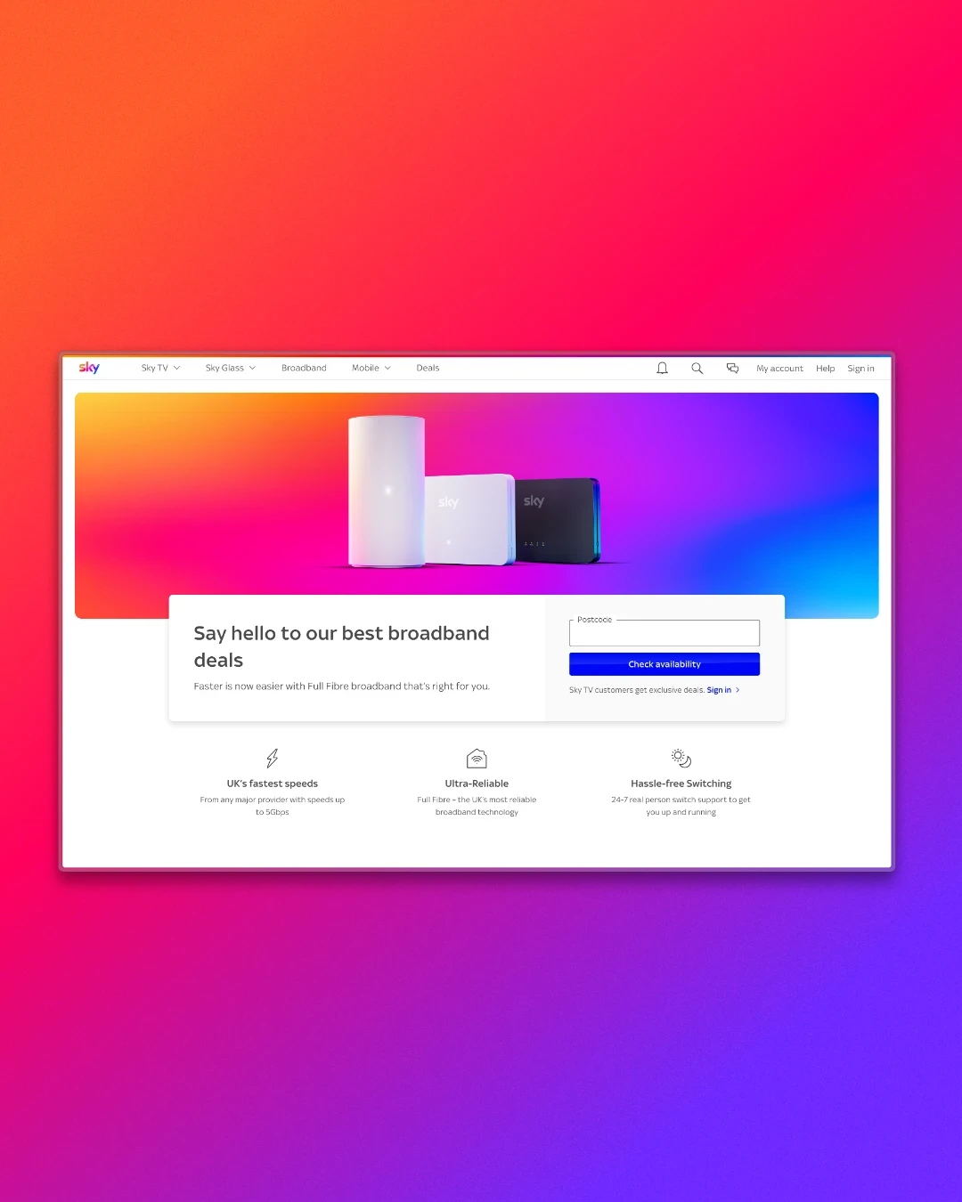
Visibility vs. Utility
The Broadband Postcode Checker is the critical first stop for users wanting to know what speeds are available at their specific address. However, research revealed that while this was the most essential feature, it was frequently lost among competing sections.
Users reported wanting a simple, direct answer but were instead forced to scroll through excessive content. From a business perspective, the page needed to do more than just show availability; it had to strengthen brand reassurance and make the switching process feel effortless.
Testing for Intent
I mapped out and tested four distinct design directions to determine how best to balance speed with trust:
Variant A (Speed-First): Focused purely on the layout speed.
Variant B (Reassurance): Prioritized "reasons to believe" to build confidence.
Variant C (Scenario Pathways): Focused on clear user paths. (The Winner).
Variant D (Trust-Led): Emphasized brand messaging.
Observations confirmed that while users valued supporting reassurance elements, layouts with the checker front and center performed the strongest.


A "Checker-First" Experience
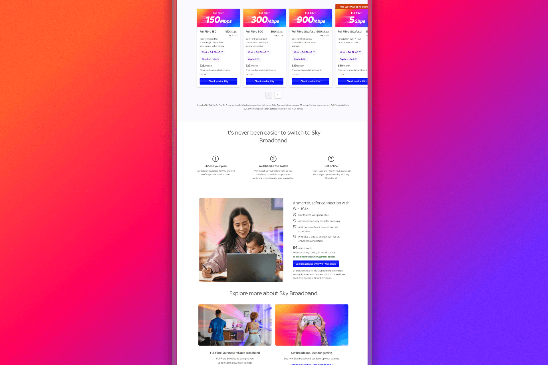
The final design places the postcode checker at the core of the page to meet user intent immediately. To support conversion, I surrounded the tool with modular reassurance elements:
Anchor Point: The checker serves as the focal point, providing the clarity users repeatedly asked for.
Confidence Boosters: I integrated clear "reasons to believe" and trust messaging to provide the confidence needed for conversion without distracting from the main task.
Frictionless Switching: A dedicated switching module was added to address one of the most powerful user motivators identified during testing.


92% Direct Engagement
The redesign transformed a functional tool into a persuasive brand experience. Quantitative and qualitative testing validated the new hierarchy:
Behavioral Shift: 92% of users in the winning variant went directly to the checker.
Higher Conversion Intent: The design achieved the highest ranges for clarity, confidence, and likelihood to purchase.
User Sentiment: Participants described the new experience as "straightforward" and "reassuring".